SiS MANAGER · TBL

Redesign product and brand while keeping every customer.
Client
TBL
Year
2022
Role
Product Strategy · UX · IA · Brand System
Made with
Freelance · with a UX strategist
Category
B2B SaaS · ESG monitoring
Stakes
Repositioning without resetting the relationship
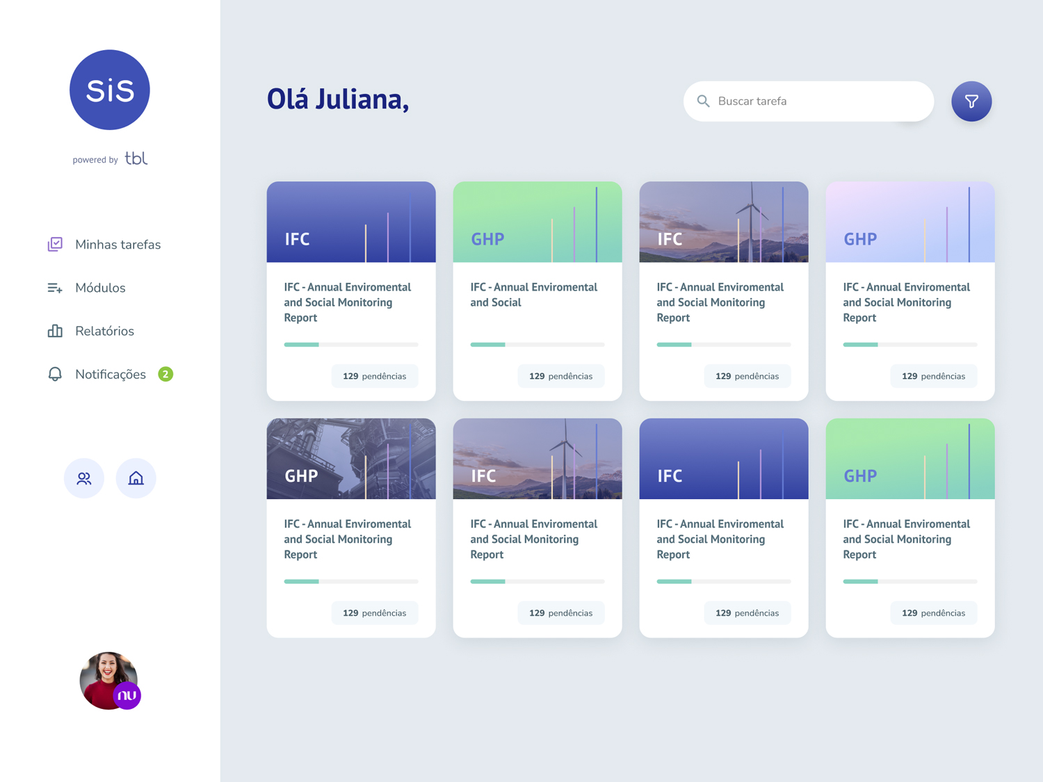
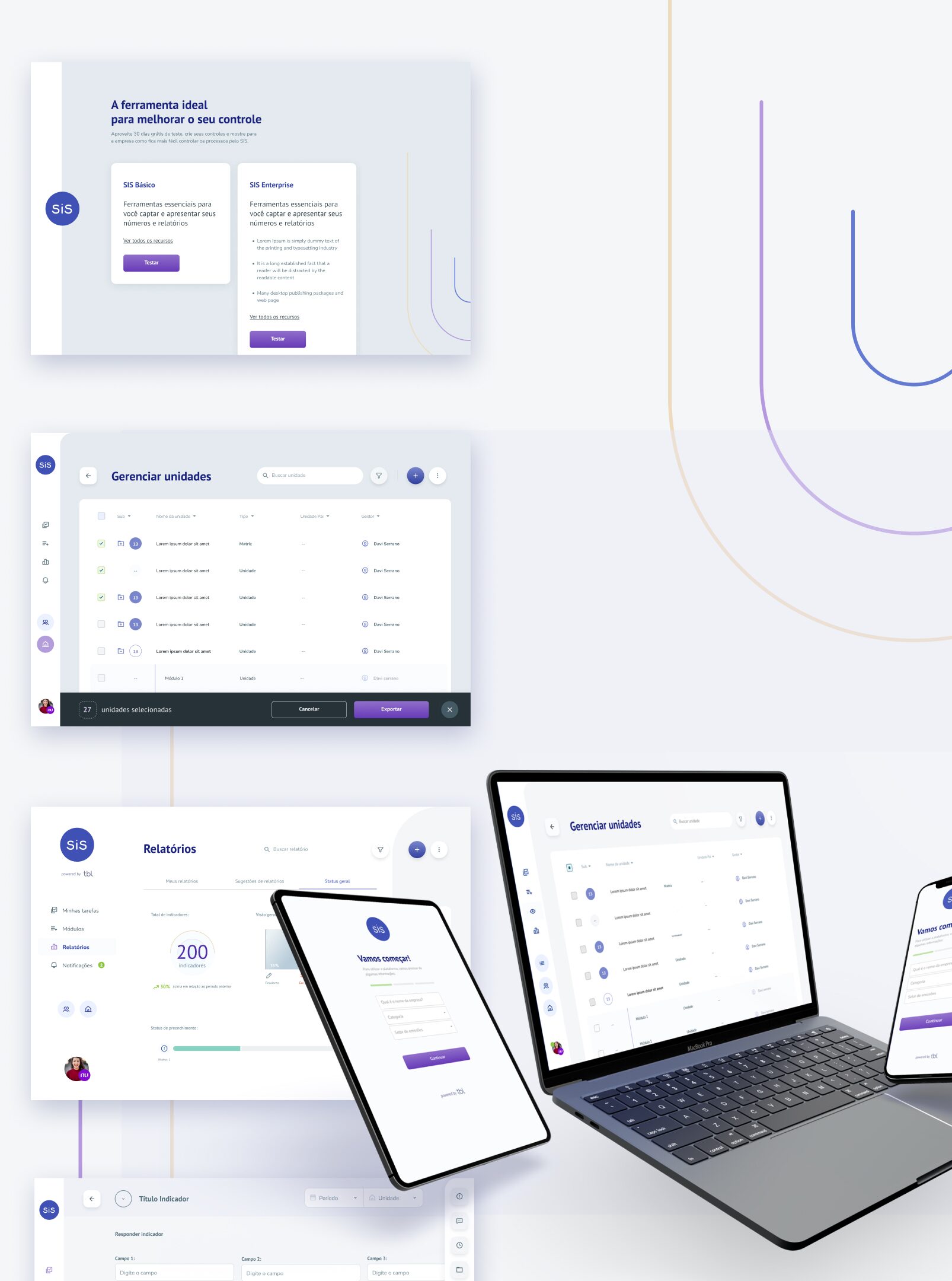
SiS Manager · the redesigned product, hero shot. Refreshed visual system, journey-based platform, modular indicators.
tbl-product.jpg
0%
Churn spike on a just-renewed customer base.
13
Distinct changes shipped in the redesign.
3
Platforms. Desktop, tablet, mobile.

The Reason

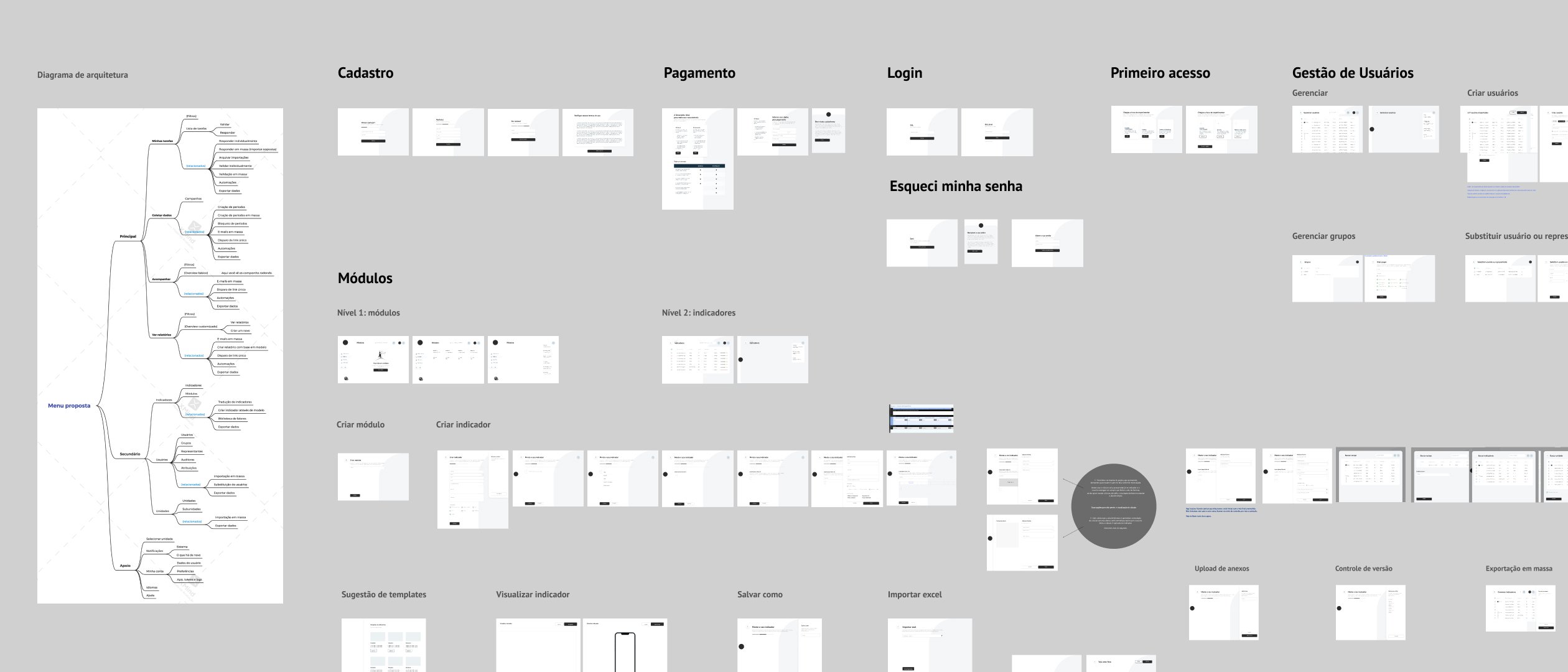
SiS Manager · the reason behind the rebuild: a B2B ESG monitoring product caught between defecting customers and incumbents that felt bureaucratic. Repositioning had to happen without resetting the relationship.
reason.jpg
The problem

Two changes at once

TBL was rebuilding their ESG monitoring product and their brand at the same time. Either could fail loudly. Together they could fail quietly.

The strategic question: can you reposition a B2B product without resetting the relationship with the customers already paying for it?

The stakes

A window to feel modern and human

ESG buyers were leaving incumbents that felt bureaucratic, which gave TBL a window. Taking it couldn't mean alienating the customers already inside the platform.

That set the constraint before any design started: whatever we changed had to be defensible to a customer who'd just renewed.

The Strategy

The strategic call

Reorganize the product around the customer's journey

The thesis we carried into discovery, and the one the interviews later confirmed: the deepest fix wasn't visual, it was structural. The platform was organized around its own data model rather than around the customer's job.

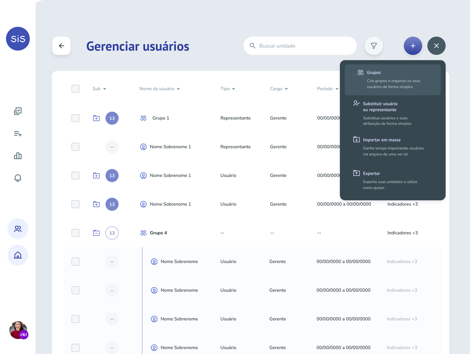
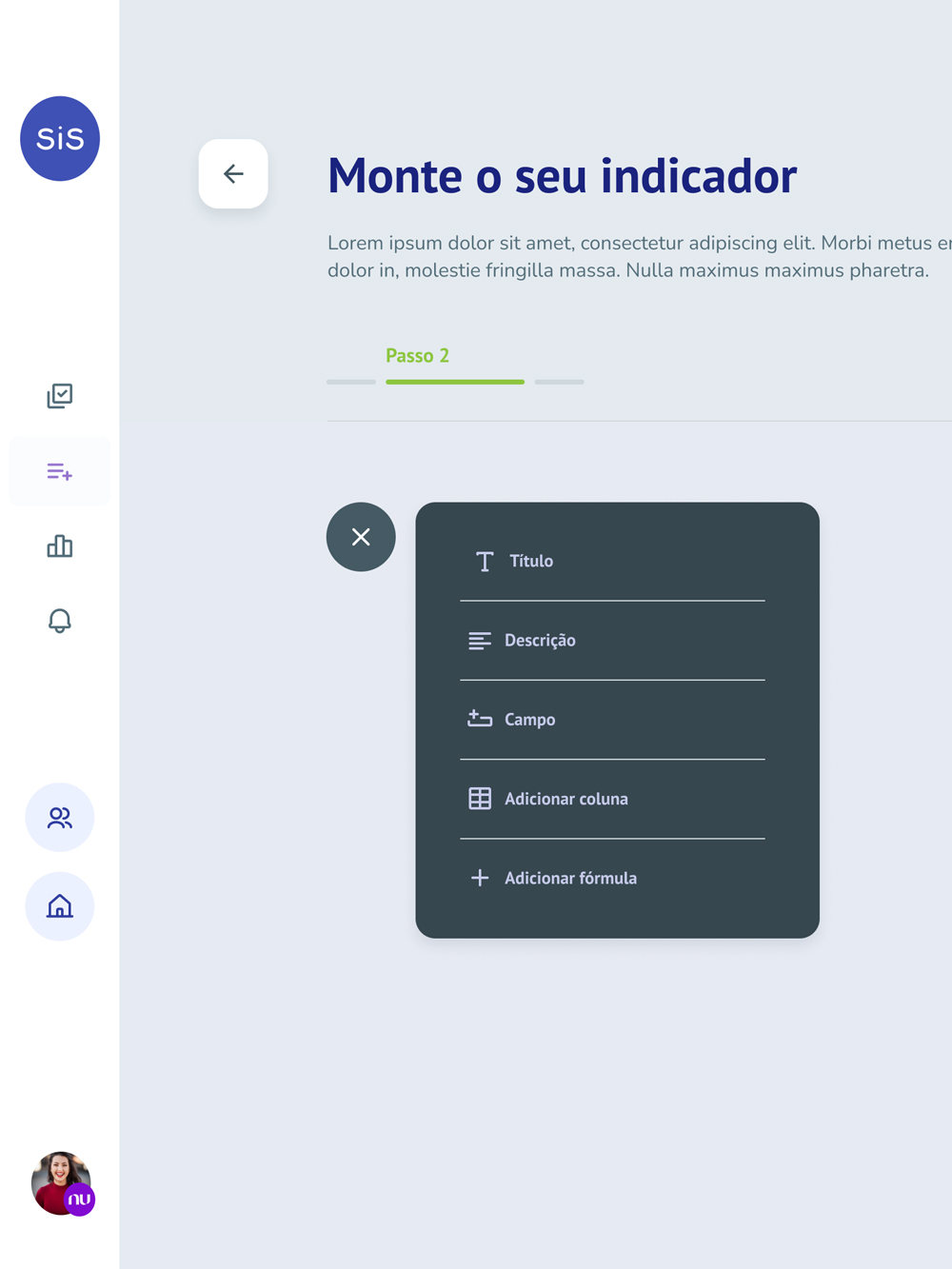
So we rebuilt the structure around journeys. Features now surface at the moment and in the place the work happens, instead of sitting under abstract menus. Secondary functions (mass emails, factor libraries, indicator templates) became contextual shortcuts inside the journey rather than a separate area to hunt through.

The brand evolution rode on top of that: a lighter, more modern visual system, designed straight into the new component library so the rebrand shipped as part of the upgrade. Customers read the reposition as the product getting easier to use, not as a marketing exercise.

strategy · journey-based home · preview
The redesigned SiS Manager home, reorganized around the customer's journey: relevant features and contextual shortcuts surfaced at the moment of the work instead of filed under abstract menus.
journey-home-pre.jpg
The platform rebuilt around journeys. Features surface where and when the work happens, not under abstract menus.

The Process

Discovery

Ten hours of conversations

We started with a full immersion in the existing product, mapping every flow, state and screen. Then we brought customers in. Across ten hours of interviews we asked them to walk us through their experience and tell us what to change.

The pain points stacked up fast. Some confirmed what the team already suspected. The surprises mattered more.

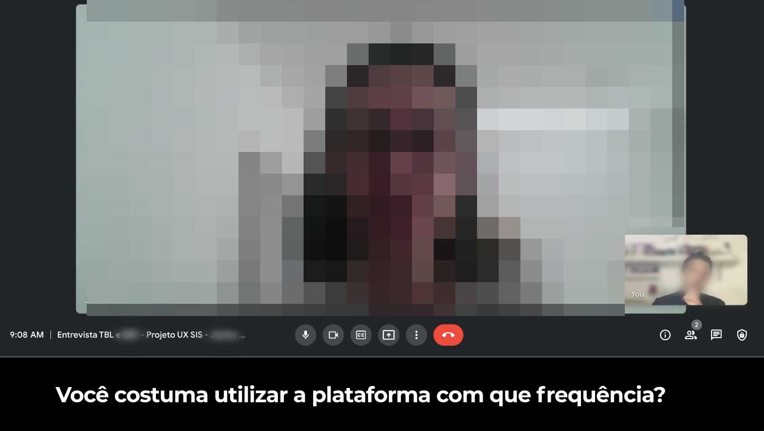
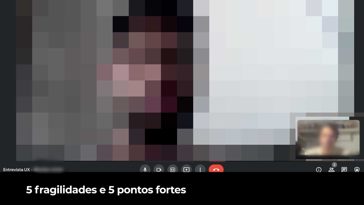
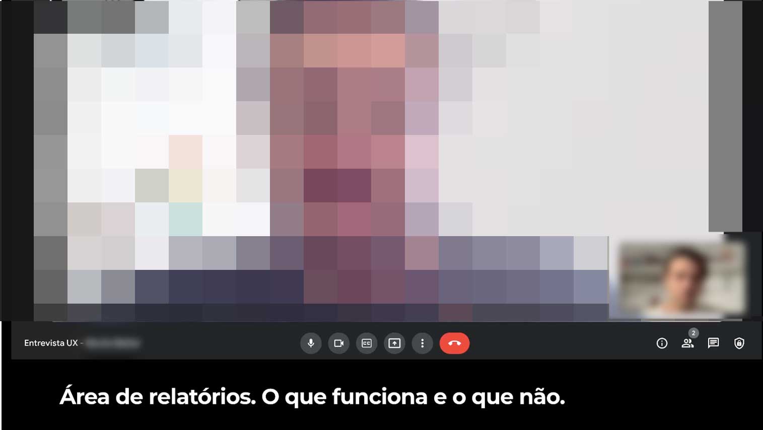
discovery · remote customer interviews · 3-up
meet.google.com · Entrevista UX · SiS
Remote customer interview for SiS Manager, face blurred for privacy. On-screen prompt: 'Você costuma utilizar a plataforma com que frequência?' (how often do you use the platform?)
meet.google.com · Entrevista UX · SiS
Remote customer interview for SiS Manager, face blurred for privacy. On-screen prompt: '5 fragilidades e 5 pontos fortes' (five weaknesses and five strengths).
meet.google.com · Entrevista UX · SiS
Remote customer interview for SiS Manager, face blurred for privacy. On-screen prompt: 'Área de relatórios. O que funciona e o que não.' (reports area, what works and what doesn't).
Ten hours of remote customer interviews, then synthesis, then prioritization. The pain points that mattered most were rarely the ones the executives had named.
What customers told us

Seven things to fix

We collapsed the customer feedback into seven categories. Every screen we eventually redesigned had to answer to at least one of these.

customer evidence · seven categories
Pain points · what customers told us
01
Information architecture

Easy to understand how features and content are organized.

02
Usability

Easy to navigate without getting lost in the volume of data.

03
Dashboard, reports, history

Easy to find information, build different views, compare new with old.

04
Process tracking

Easy to control status, versions, approvals, traceability. From collection to final verification.

05
Information reliability

The data feels right, regardless of which view it's presented in.

06
Notices and alerts

Customers know what's happening, what they need to do, and how often.

07
Visual

Simpler. More modern. More human.

Every change we shipped traces back to one of these seven.

The Results

Outcome

Repositioned without resetting the relationship

No churn spike on a customer base that had just renewed. Customers experienced it as a service upgrade. The brand evolution rode in on the back of usability.

Key changes

What changed

Thirteen distinct things shipped in the redesign. Six of them carried most of the strategic weight.

Highlight 01

Contextual shortcuts

Secondary features (mass emails, factor library, indicator templates) moved out of the menu and into the contexts where they make sense, so the right tool shows up at the right step of the work.

The functionality appears in the right place at the right time.
SiS Manager · Shortcuts
Contextual shortcuts in the redesigned SiS Manager · mass emails, factor library, and indicator templates surfaced inline within the customer's journey instead of buried in menus.
Highlight 02

My Tasks

A new area consolidates everything the customer needs to act on: approvals, follow-ups, pending entries. No more hunting through the platform for what's owed.

Every action that depends on you, in one place.
SiS Manager · My Tasks
My Tasks page in SiS Manager · a single screen surfacing every approval, follow-up, and pending entry the customer needs to act on.
Highlight 03

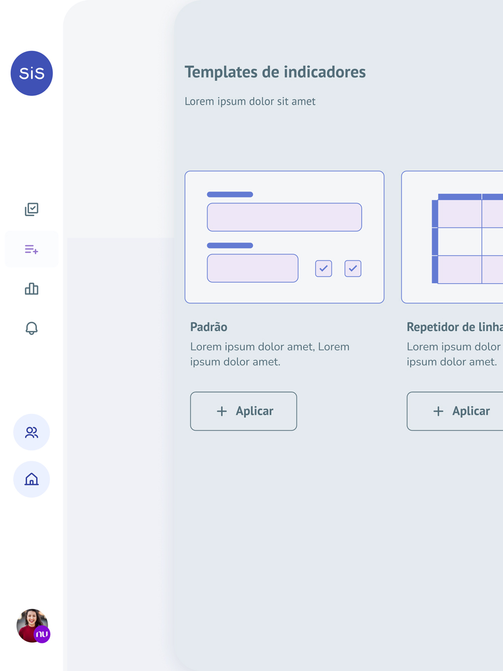
Indicator + report templates

Customers who don't want to configure anything no longer have to. Pre-built indicator modules and report templates populate with their data and update on their own. The platform now covers both ends: configure everything, or open and go.

From "configure everything" to "open and go."
SiS Manager indicator templates · first variant: pre-built indicator module ready to drop in.
indicator-1.jpg
SiS Manager indicator templates · second variant: configured module auto-populated with the customer's data.
indicator-2.jpg
SiS Manager indicator templates · third variant: report template generated on top of the same data.
indicator-3.jpg
Highlight 04

Dashboards

The reports area was rebuilt. Custom reports still work the way they did, but alongside them sit pre-built templates and live data views that update and surface insights with no configuration at all, in the new visual system.

Reports that read themselves.
SiS Manager · Dashboards
The redesigned SiS Manager dashboard area · pre-built templates and live data widgets that update and generate insights without manual configuration.
Highlight 05

Digital brand system

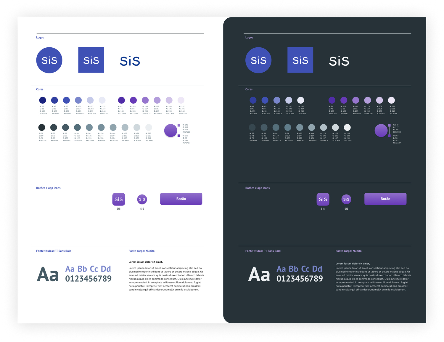
Underneath every screen change is a refreshed component library and design system. Buttons, inputs, cards, charts, navigation patterns. Designed once and reused across every surface of the platform. The rebrand shipped as part of the system, not as a paint job applied on top.

The visual language, kept as a living library.
SiS Manager · Design system
The SiS Manager design system · refreshed component library showing buttons, inputs, cards, charts, and navigation patterns shared across every surface of the platform.
Highlight 06

Multi-platform

The new platform works on desktop, tablet, and mobile, without making the mobile experience an afterthought.

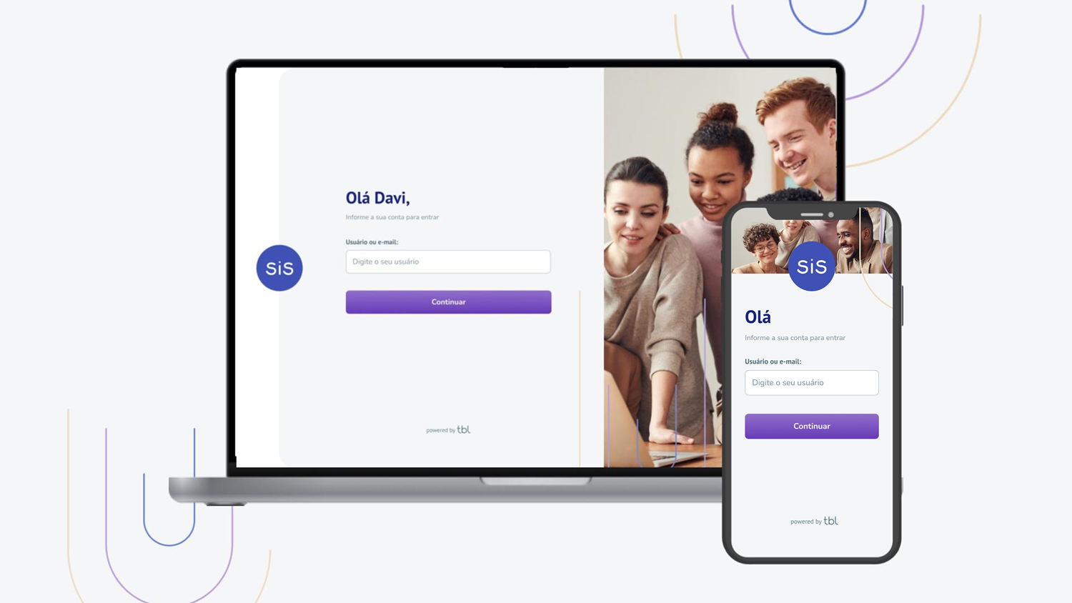
Desktop, tablet, mobile. The same product, sized for the surface.
SiS Manager rendered across desktop, tablet, and mobile · the same redesigned product, scaled and re-laid-out for each surface.
multiplatform.jpg
Before / After

Three screens, side by side

The screens customers spend the most time on. Login, indicator management, and reports. Paired with what they replaced.

signature · before / after · the three screens customers live in
Before. Pre-redesign
SiS Manager login screen · pre-redesign · busy form with extra fields and dense visual treatment.
before-login.jpg
After. Does less, asks for less
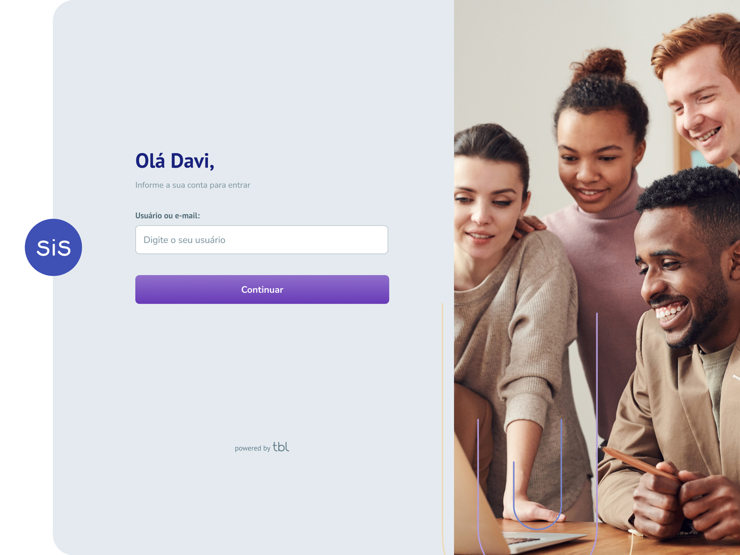
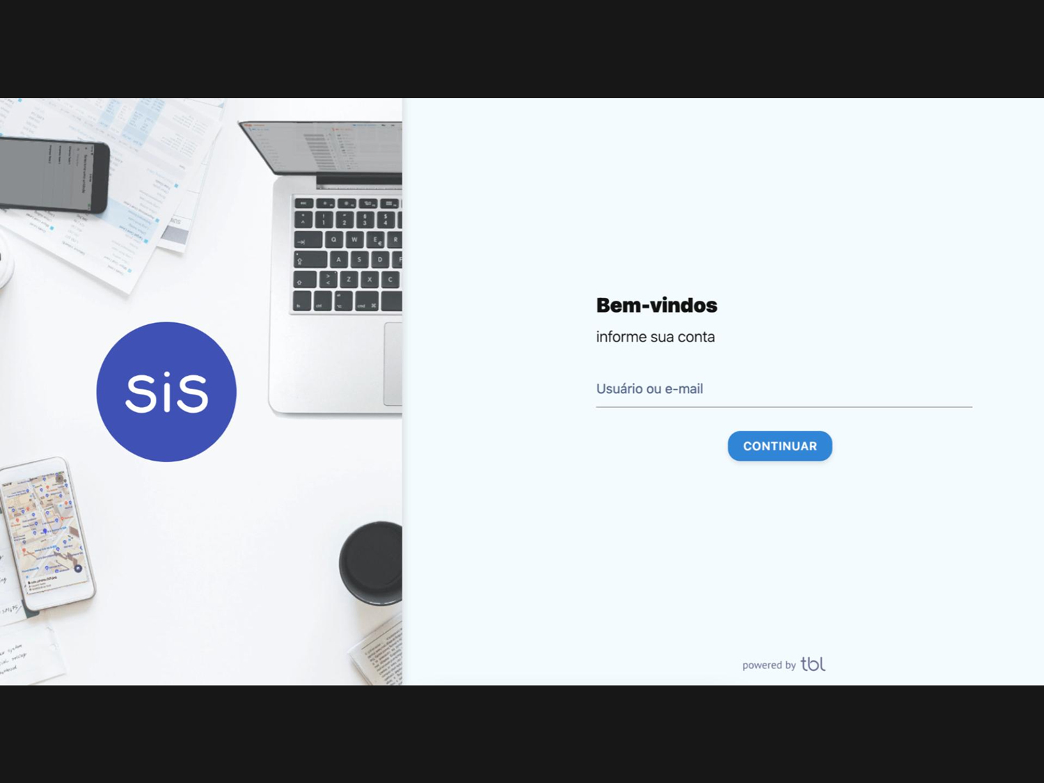
SiS Manager login screen · redesigned · pared back to the minimum the customer needs to authenticate.
after-login.jpg
Login. The new login does less and asks for less.
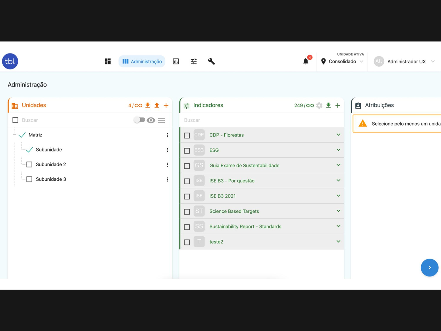
Before. Flat list
SiS Manager indicator management · pre-redesign · flat list of every indicator, no contextual grouping.
before-management.jpg
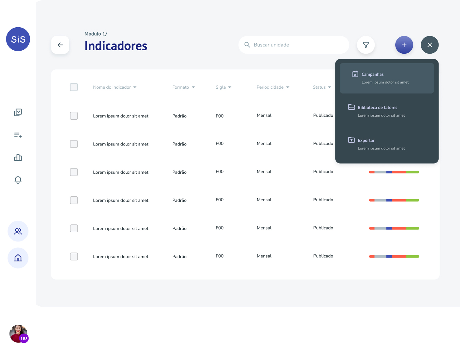
After. Modular, in-context
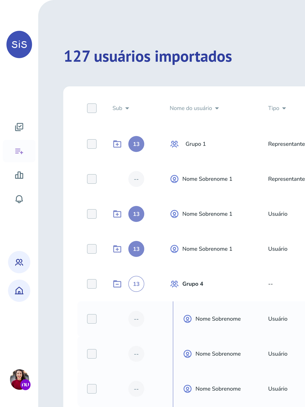
SiS Manager indicator management · redesigned · indicators grouped into modules and surfaced inside the journey they belong to.
after-management.jpg
Indicator management. Indicators now live inside modules. Easier to organize, easier to consume.
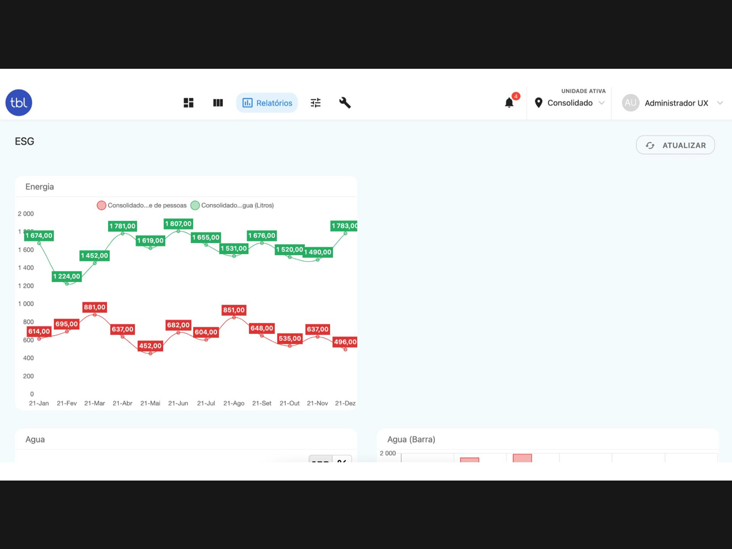
Before. Custom only
SiS Manager reports · pre-redesign · every report had to be configured by hand.
before-reports.jpg
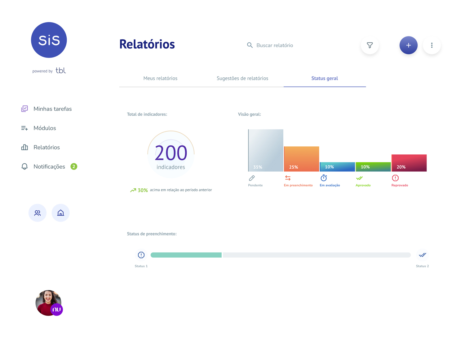
After. Templates + auto-update
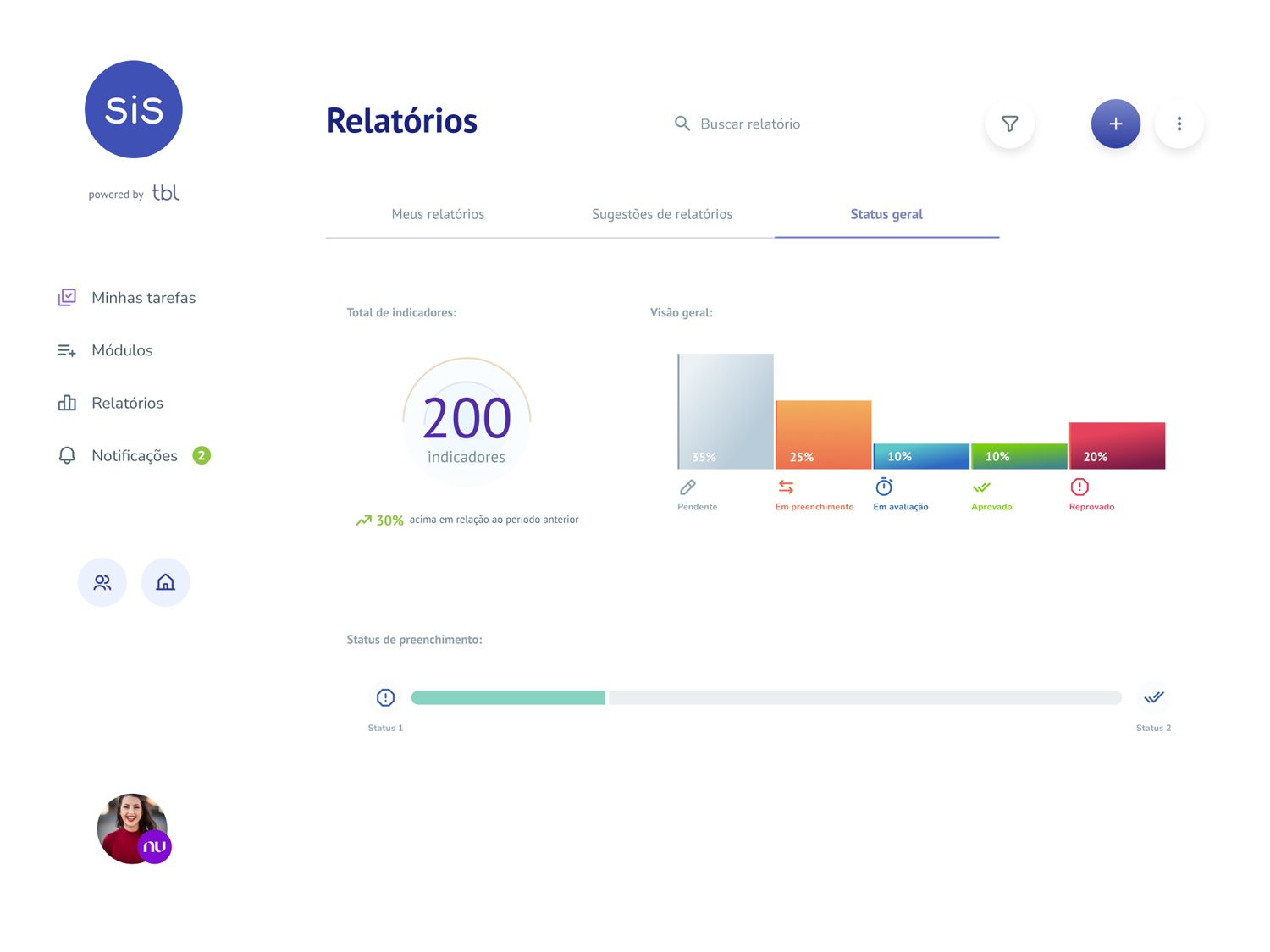
SiS Manager reports · redesigned · pre-built templates and views that update with the customer's data automatically.
after-reports.jpg
Reports. Custom reports stayed; the new area added pre-built templates and views that update on their own.

Existing customers felt less friction immediately. New customers found their way faster.

The redesign and the rebrand shipped as a single upgrade, and customers read it as the product getting easier to use. For a repositioning aimed at people already paying, that quiet reading was the whole win.
Credits

Client · TBL (2022)
Engagement · Freelance, alongside a UX strategist
Product strategy, UX & brand system · Davi Serrano

More work
Back to all work
© Davi Serrano work.daviserrano.com